Dashboard As Learning-Cockpit, Not Admin-Tool
I built a dashboard for a sovereign-AI box I gave to a friend. The first version was technically complete and socially dead. The second version is a teaching surface. The difference between the two is the design intent. This post is the worked example.
The story arc is one I have repeated three times now, each time slower than the last to draw the same conclusion. A dashboard that shows status is a status board. Status boards are museum pieces. They get opened once when the system is first installed, then never again unless something breaks. Status boards do not teach. They make the present moment legible and the past invisible.
A dashboard that teaches has a different shape. Every visible element answers the question “what does this mean and what should I do about it” without leaving the dashboard. Teaching dashboards get opened daily because the user is using them to learn. The dashboard becomes the canonical place the user goes to understand what the system is doing, in the same way a textbook gets opened to look something up.
This post is about the second kind. The pattern came together over a 24-hour build for a friend who had never run Linux. The detailed setup-day mechanics are in the 24-hour setup-log post. The friend-setup design context is in the sovereign friend-setup concept post. This post is the UX-pattern that grew between them.
Status-board, briefly
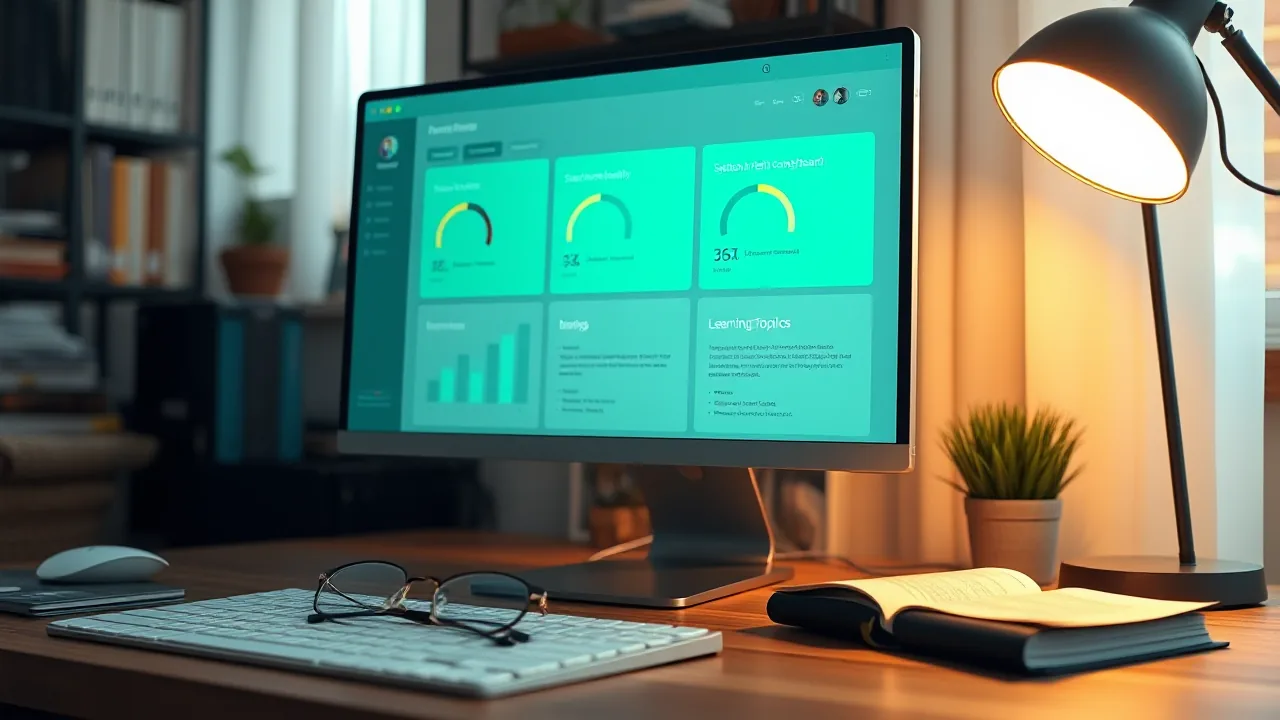
The dashboard I started with had four tabs: Status, LLM, RAG, Services. It showed GPU utilization with a progress bar, RAM used over total, disk percentages per mount, container status with green and red chips, audit-check results in a table.
It was a competent piece of work. It had been built with the DGX Spark pattern I ship for myself (covered in the sovereign-dashboard architecture post), with a FastAPI backend exposing a stable JSON API and a single-file React-without-JSX frontend that polled every five seconds and re-rendered. The audit checks ran on the backend and returned results with severity tags. The actions on the backend were allowlisted and triggered via signed POST requests with explicit confirmation prompts.
The friend opened it once on day one. He looked at it for 90 seconds. He closed it. He did not open it again until day four, when something stopped working and he needed to check whether a service was up.
I asked him later what he thought. He said it looked nice. He said he did not know what most of the words meant. He said he did not know what to do with the information even where he did know what the words meant.
This was the data I needed. A dashboard built for an admin does not work for a user. The fact that the dashboard was visually correct made the failure mode more invisible: the dashboard was not bad, it was wrong-shape.
I rewrote it.
The five-section pattern
The single most consequential change was an info-button. The pattern is: every metric, every container, every audit-check, every model has a small round button with a question mark next to it. Clicking the button opens a side-drawer with five sections in fixed order.
What is it. Two paragraphs of plain prose. Avoids jargon. Defines terms when it has to use them.
Why does it matter. One or two paragraphs. Explains what the user gets out of paying attention to this thing.
Pros and cons. Two short lists. Honest. The cons list is at least as long as the pros list because the unstated cost of any choice is the one the user pays.
Best practice. One paragraph. What I recommend, with the reason. Includes the words “Anpassbar” or “you can change this” when applicable.
CLI to verify yourself. One or two shell commands the user can paste into a terminal to check the same thing the dashboard is showing. The commands are paste-ready, with comments.
The format does not vary across topics. Every info-button opens a drawer with the same five sections in the same order. This consistency is the load-bearing part. After three drawers, the user has internalized that the answer is always there, always shaped the same way, always one tap away.
The backend serves the five sections as a static dict keyed by topic. The dashboard has 27 topics covering everything from VRAM and conservation-mode to MCP and embedded vector databases. Each topic is between 200 and 600 words. The total content in the dictionary is about 12000 words, which is one good article’s worth.
A simplified backend extract:
EXPLAIN: dict[str, dict] = {
    "vram_paradox": {
        "title": "Why VRAM shows 0 GB used when 4 models are installed",
        "what": "Ollama loads models on demand...",
        "why": "VRAM is the fast memory directly on the GPU...",
        "pros": ["Saves GPU power when idle", "..."],
        "cons": ["First prompt after idle takes 1-2s extra", "..."],
        "best_practice": "Default is fine for most use. If you do bursty work...",
        "cli": "nvidia-smi --query-gpu=memory.used,memory.total --format=csv",
    },
    # 26 more topics
}
And a simplified frontend extract:
const InfoBtn = ({topic, onOpen}) =>
  e('button', {
    onClick: (ev) => { ev.stopPropagation(); onOpen(topic); },
    title: 'Erklärung',
    style: {
      background: 'transparent', border: '1px solid '+BDH,
      color: CY, width: 24, height: 24, borderRadius: 12,
      fontSize: 14, cursor: 'pointer',
    },
  }, '?');
The info-button sits next to its topic and is small enough to not steal attention. The user notices it when he wants the answer.
The persona-cross-reference pattern
The second high-impact change was on the model descriptions. The dashboard exposes five LLMs to the user: Qwen3 8B local, Mistral 7B local, Llama 3.1 8B local, DGX Spark Qwen-3.6 remote, and a custom Persona called Grill-Me.
Each model’s description includes a Persona paragraph that does two things. It states the character the model is tuned for. And it explicitly contrasts that character with the other models on the list.
Qwen3 8B’s description says: “Persona: the precise technician. Structured answers, direct style, good code output. Unlike Mistral (mediterranean-relaxed), Llama (long-form analyst), and Grill-Me (sharp skeptic).”
Mistral 7B’s description says: “Persona: mediterranean serene. Relaxed clarity, occasional cultural reference, no filler. Unlike Qwen (precise technical), Llama (long analyses), and Grill-Me (sharp skeptic).”
The same pattern across all five. Every description references the other four. The user learns the difference between the models by reading any one description, then validates it by reading another, then talks to the model and finds the validated prediction either holds or does not. The cross-references calibrate expectations faster than spec sheets do.
There is a discipline note at the bottom of every Persona paragraph: a one-line “Anpassbar” or “customizable” hint that says “this is just an example. The system prompt can be changed. You can build your own Persona from scratch.” The hint is load-bearing. Without it, the user treats the defaults as canonical and stops experimenting. With it, the user understands that the defaults are starting points.
The honest capability flags are also a Persona-adjacent design choice. Every model description includes the capability list with the actual values: vision false, citations true, tool-calling true, reasoning available-with-flag. Qwen’s vision flag is false because the 4-bit quantization stripped the vision tower. Llama’s vision flag is false for the same reason. Mistral’s vision flag is false for the same reason. DGX Spark Qwen-3.6’s vision flag is false because the vLLM service runs with --language-model-only. The truthful answer for the user’s stack in 2026 is “no model on this dashboard can see images, here is why,” and the capability flags surface that without surprise.
The Doctor tab pattern
The third change was a tab called Doctor. It runs 12 audit-checks on every backend poll and returns each result with a severity tag, a short status, a one-paragraph summary, and (if applicable) a fix-button that triggers an allowlisted remediation action.
A sample of the checks:
- NOPASSWD-sudoers Setup-Backdoor. Status: present. Severity: warning. Summary: the install used a NOPASSWD sudo entry to bootstrap. Should be removed before handover. Fix-button: triggers the script that removes the entry.
- AppArmor User-Namespaces erlaubt. Status: yes. Severity: info. Summary: required for Brave sandbox to work. Documented trade-off, not a fix. No fix-button.
- Automatische Sicherheits-Updates. Status: running. Severity: ok. Summary: unattended-upgrades is active. No fix-button needed.
- Plattenplatz. Status: root 78%, home 7%. Severity: ok. Summary: under 85%. If you get a warning, run
docker system prune. - AIDE Filesystem-Integrity. Status: clean / changes_detected / unknown. Severity: ok / warning / info. Summary: AIDE last ran at TIMESTAMP. If changes_detected, click the resolve-button after you’ve verified they are expected.
- Watchtower-Container-Updater. Status: label-enable mode. Severity: ok. Summary: only containers with the opt-in label are auto-updated. Conservative default.
Each check is a Python function that returns a dict. The functions run in parallel via asyncio.gather. The full check-list runs in under 200ms because most of the checks are lightweight (file existence, systemd unit status, container label inspection).
The fix-buttons matter as much as the checks. A check that says “you should remove the NOPASSWD entry” with no fix-button leaves the user with homework. A check that says “you should remove the NOPASSWD entry, here is the button” lets the user act on the audit result in the same tab without context-switching. Many of the checks have no fix-button because the remediation is multi-step or requires user judgment. But the ones that have an obvious one-line remediation, get the button.
The AIDE-Resolve UI is a special case worth describing. the DGX Spark’s dashboard had a “Klick: ich war das” (“click: that was me”) button for AIDE results that detected file changes. The button would refresh the AIDE database after the user verified the changes were expected (typically after apt upgrade). I ported the pattern to the Lenovo Legion’s dashboard. The original DGX Spark version, when I ported it, referenced a script called aide-resolve.sh that did not exist. DGX Spark had the UI without the underlying script.
So I wrote the script. Three lines that do aide --update; mv aide.db.new aide.db; write timestamp to /tmp/aide-resolved-at. Plus an apt-post-invoke hook that runs the script automatically after every apt upgrade, which prevents the daily-red-flag false-positive that plagues most AIDE installs. The DGX Spark dashboard now has the working pattern because the friend-setup forced me to make the missing piece exist.
The Learning tab pattern
The Learning tab is a curated stack-tour. It is structured as four sections (Hardware, AI Stack, Security-and-Network, Containers-and-Apps) with three or four topics each. Each topic is a single click that opens the same five-section side-drawer used elsewhere.
The tour is curated, not generated. The order is pedagogical: VRAM before VRAM-paradox, RAG before mcpo, nftables before AppArmor. The friend who works through the tour in order has a usable mental model of the stack after about 90 minutes.
There is a Glossary topic at the top of the Learning tab that defines every acronym the dashboard uses. KB, RAG, MCP, mcpo, LLM, VRAM, LUKS, DoT, NLE, NVENC, embeddings, tokens (KI vs Auth), persistence mode, conservation mode, fwupd, unattended-upgrades. The Glossary is its own info-drawer content with about 1500 words. The friend looks up “what does MCP mean” once and the answer is right there.
There is a discipline I learned from this. The Glossary belongs in the dashboard, not in the documentation. Documentation is a place the user goes when he is already confused. The dashboard is a place the user goes anyway. Pulling the Glossary into the dashboard means it gets read in the natural flow of using the system, not as an emergency reference.
What I got wrong in version one
The first version of the dashboard had three specific UX mistakes worth naming.
Neon-green on near-black. I had picked a “retro hacker” palette: bright neon green (#39FF14) on near-black (#070d07). It looked striking. It also became unreadable after 20 minutes of looking at it. The friend mentioned that his eyes felt tired. I replaced the palette with a sage-green-on-warm-dark (#9bc188 on #161a14) and the eye-fatigue complaints stopped. The new palette is what the dashboard ships with. The CSS variables are in the single file for easy review:
:root {
  --neon: #9bc188;        /* sage, not 14-bit green */
  --bg: #161a14;          /* warm dark, not pure black */
  --txt: #d1d8c5;         /* soft warm-green-white */
  --fs-body: 16px;        /* not 13px */
  --fs-prose: 17px;       /* readable for prose explanations */
}
The font sizes also moved up. The dashboard was originally 13px because that is what DGX Spark uses. The friend has reading glasses. DGX Spark was sized for me, not for him. The new defaults are 16px and 17px and there is no eye-strain complaint anymore.
App-window mode for OpenWebUI. I had set up Brave with --user-data-dir profiles per web-app, so that OpenWebUI opened in its own isolated Brave window with no tab chrome. It looked clean. It also meant the isolated Brave window did not have the Bitwarden extension. The friend could not autofill his OpenWebUI password. The fix was to revert to normal Brave tabs with bookmarks. The app-window-feel was not worth the password-manager loss for an interface the friend uses daily.
AIDE-Resolve UI without the script. I had ported the DGX Spark “click: ich war das” button without realizing the underlying script did not exist on the DGX Spark side either. The button was an empty signifier on the Lenovo Legion side because the function it was wired to did nothing. I wrote the missing script, including the apt-post-invoke hook that prevents the daily-red-flag false-positive, and now both the Lenovo Legion and DGX Spark dashboards have the working pattern. The friend-setup forced the missing piece to exist.
What surprised me
The friend opens the Learning tab more than the Status tab in the first week. This was not the predicted use-case. I had assumed the Status tab would be the daily-driver and the Learning tab would be the occasional reference. The actual data was the inverse. The friend is using the dashboard to learn, not to monitor.
This validated the design intent. The Status tab is still there and still useful. It is not where the daily value sits.
The audit-check fix-buttons get used more than I expected. The “remove NOPASSWD entry” button got pressed on day two. The “restart kb-indexer” button got pressed when the friend wrote his first KB note and wanted to confirm it would be searchable. The “test DNS resolution” button got pressed during a brief connectivity issue. Each button-press resolved its situation in one tap. Without the buttons, each situation would have required either a documentation lookup or a chat with me. The buttons cut latency to action by an order of magnitude.
The Persona descriptions get read more than I expected. The friend can quote three of the five Personas from memory after two weeks. He picked Grill-Me to review a project plan he was about to commit to. The Persona-cross-reference pattern is doing what I designed it to do, which is letting him predict model behavior before talking to the model.
What I would tell other dashboard builders
Two practical takeaways from this rebuild.
Cost the user’s attention more carefully than you cost your own. A status board demands the user’s attention as a precondition for being useful. If the user does not know what GPU utilization means, the GPU bar tells him nothing. If the user does not understand AIDE, the AIDE-check result is a yellow flag with no signal. A teaching dashboard pays the user’s attention back by making every demand-for-attention also a giving-of-understanding. The user looks at the GPU bar and tapping it teaches him what GPU utilization is.
Ship missing pieces, not pointers to missing pieces. The DGX Spark AIDE-Resolve button without the resolve script was the kind of mistake that propagates: ports of the pattern would have propagated the missing piece too. Writing the missing script the first time I needed it on the Lenovo Legion side closed the loop everywhere. If your dashboard references a thing, the thing should exist.
What is next
The dashboard pattern is shippable as a single FastAPI backend file plus a single React-without-JSX HTML file. The Lenovo Legion dashboard source is published as kb/legion-dashboard in my local Gitea, available to the friend, and may eventually go to public GitHub if I clean up the names. The DGX Spark dashboard source is more entangled with my specific deployment and is not currently public.
The pattern is the transferable artifact. The info-button, the five-section drawer, the Persona-cross-reference, the Doctor-tab with fix-buttons, the Learning-tab with the curated stack-tour, the Glossary-as-dashboard-content, the augenschonend palette, the readable font sizes. These are not platform-specific. They are how a dashboard becomes a teaching surface instead of a museum.
If you build a dashboard, build it for someone who does not yet understand the system. The user who already understands the system can read your code. The user who does not, needs your dashboard to do the teaching work.
What I learned later (2026-05-30 update)
The “ship missing pieces, not pointers to missing pieces” principle in this post had its inverse exposed to me the day after I drafted it. I am appending the inverse because the dashboard pattern documented above is incomplete without it.
Measure first, install second. The original principle says that if your dashboard references a thing, the thing must exist. The inverse, which I broke twice in one day, says that if your install fixes a thing, you must have measured the thing first. I installed Plymouth on the friend’s box to fix an unfriendly boot screen, and the install locked him out of his LUKS prompt on the next reboot. I installed EasyEffects to fix tinny internal speakers, and the install added a PipeWire pipeline on top of a hardware-driver gap that no amount of software processing was going to close. Both installs were ten minutes of work. Both produced confident-looking fixes. Neither was a fix because neither was preceded by a measurement of the actual root cause.
The dashboard implication is a new Doctor-tab check class. The audit checks in the Doctor tab currently cover system state (NOPASSWD entry present, AppArmor namespaces allowed, disk usage, AIDE state). I am adding a new class called “unverified-install warnings” that flags configurations the dashboard knows were installed as fixes but for which it cannot find a corresponding root-cause-recorded marker. The check is keyed to a ~/docs/decisions/ directory with one Markdown file per fix-install, each with a “root cause measured” section. If a fix is installed but no decision-file exists, the check warns. The point is to make the absence-of-measurement visible at the same surface where the user already looks for system health, rather than hidden in my own engineering discipline.
The inverse-principle sentence the friend’s dashboard now ships: “A dashboard that references a thing is responsible for that thing existing. A user (or operator) who installs a thing is responsible for having measured what the thing is fixing.” Both halves go into the Learning-Tab as a single topic on engineering discipline. The dashboard is a teaching surface for the operator too, not just for the user, and the missing-pieces principle had to be paired with the unverified-install principle to be complete.
What I undid: removed Plymouth (added plymouth.enable=0 back to GRUB), removed EasyEffects (uninstalled the package, removed the user-service), and wrote both removals into the decisions directory with the actual measurement-data I should have collected before the original installs. The decision files are now the canonical record. If I install another “fix” without writing the decision file first, the Doctor-tab check will flag it.
Sibling posts on this thread
24 Hours Setting Up a Lenovo Legion Pro 7 Gen 10 is the day-of mechanics post that includes the dashboard rebuild as one of the day’s milestones.
Sovereign Friend-Setup: When You Build A Box For Someone Else is the concept post on what changes when the operator is not the user.
We Were Wrong About Local 8B Tool-Use is the technical post on why the local models in this dashboard’s LLM tab work well enough to be the default.
The /data/ Convention Trap on Standard Ubuntu LVM is the storage-architecture post on the mistake the friend never saw.
Two Tailnets, One Shared Node is the privacy-primitive post that explains the network-side of the friend-setup.